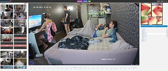
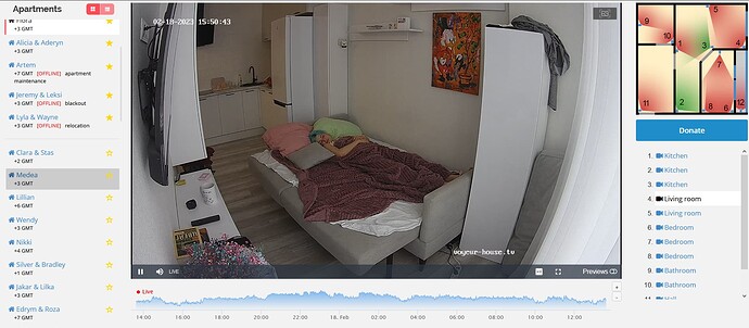
Would it be at all possible to make the right side where the cam selection is scrollable just like the left hand side? Not sure if this has been brought up before as I didn’t see it as I scrolled down though the topics here.
This was already in beta mode.
Thank you, I wasn’t aware… 
it would be great to have this feature online soon. it’s very annoying to scroll down the whole site just to switch the cam
Another suggested option which may be easier and quicker to change, is to link the numbers in the map to the cameras
Was suggested years ago yet nobody cares… 
Also, how about reducing the spacing on the list. There is one realm now that has 22 cameras !!!
VHTV does not answer to the suggestions here. There is no need to suggest anything…
Sorry, I was replying to the topic. Is there a suggestion tab?
No need to be sorry  What suggestion tab you mean?
I don’t know when this came into effect, but being able to scroll the cam list is a great improvement ![]()
Makes it so much easier watching realms with many cams ![]()
I just discovered it too. That’s really a good improvement. ![]()
oh man, maybe for the cell phone, but for the PC I find it extremely suboptimal.
@VHTV if i may make an alternative suggestion: i think the maximum currently is 30 cameras… and hardly any camera name really has a lot of text. why don’t you make the frame with the list of cameras in two columns with a break after camera 15 or 18 (that gives some reserve)? this should work on all devices…
or give us the option, as with the selection of the apartments, to switch between 2 views, with or without scrollbar, or with one column or 2 columns
It’s better on PC too. 10 cams are now displayed and then you can scroll. If more cams were displayed, you would automatically scroll up the screen if you wanted to click on cam 15, for example. And two columns would make the frame too wide.
I like how it’s done now and would like to keep it that way.
hmm, a matter of opinion…
But there are mechanisms for detecting whether there is enough space if the screen is too small, with automatic switching between scrolling and 2 columns…
(image replaced in previous post)
ok, i only have 4k monitors here, that’s why it looks so different here.
but that again calls for options that either display the UI differently because of the resolution, or options for us to toggle that as needed
With 4k screens, I can understand that you have other wishes. ![]()
It’s ideal for me now. ![]()
@vhtv what is your opinion on this and what is feasible?
Looking at your replaced pic, at least I know I won’t buy a 4k screen… ![]()
I already have problems with my eyes on my screen, but with your screen I would have to set the resolution so large that I would probably have to scroll back and forth horizontally all the time… ![]()
you’re wrong ![]() my font is the same size as yours, i just have more space, so it looks so small
my font is the same size as yours, i just have more space, so it looks so small

